
Foreign Travelers Expect to Book via Smartphone
For foreign tourists visiting Japan, smartphones are essential tools for gathering information, selecting stores, and making reservations during their travels.
After discovering hotels, restaurants, and experience services in Japan through Google searches, Google Maps, or social media, many users directly access reservation pages on their smartphones.
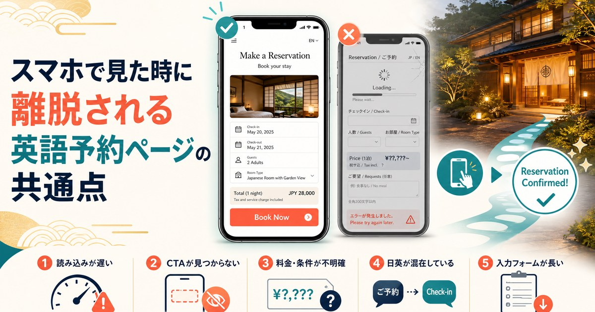
However, even with an English reservation page available, there can be instances where "the page is opened but no reservation is made."
The cause may not lie in the English text itself. When viewed on a smartphone, issues such as the following can lead users to abandon the page:
- Difficulty finding the reservation button
- Slow page loading
- Unclear pricing and conditions
- Mixed Japanese information
- Excessive input fields
- Reservation methods tailored for Japanese users
Thus, simply translating into English does not guarantee a "user-friendly reservation page for foreigners."
What matters is designing the page so that foreign users feel it is "clear," "reliable," and "easy to book" when viewed on a smartphone.
1. Reservation Button Not Easily Found on Mobile
The most critical element of an English reservation page is the Call to Action (CTA) for reservations.
If users cannot find buttons like "Book Now," "Reserve," or "Make a Reservation" immediately upon opening the page, they may be unsure of what to do next.
On smartphones, where screen space is limited, having the reservation button hidden at the bottom of the page can be particularly frustrating.
For example, a poor example might look like this:
Welcome to our restaurant.
We offer traditional Japanese cuisine...
[Long description]
[Photo]
[Access information]
[Menu]Reserve
In this case, users must scroll multiple times to find the reservation option.
Conversely, a good example would be:
Authentic Japanese Dining in Tokyo
[Book Your Table]
This approach makes the path to booking clear right from the first screen. It is crucial that users can understand how to make a reservation immediately upon opening the page on their smartphones.
2. Slow Page Loading
Including beautiful images is highly effective for hotels, ryokans, restaurants, and experience services.
However, using high-resolution images without optimization can slow down page loading times on smartphones.
Travelers may not always have access to high-speed Wi-Fi; they could be using mobile data while at stations, tourist spots, or on the move.
If the page takes several seconds to load, users may hit the back button and return to their Google or Google Maps search results.
To address this, it's essential for English reservation pages to:
- Compress images to appropriate sizes
- Reduce unnecessary animations
- Minimize extraneous scripts
- Prioritize mobile-friendly design
Balancing "a beautiful site" and "a fast site" is particularly important for attracting foreign customers.
3. Unclear Pricing and Reservation Conditions
One major reason foreign users hesitate to book is the lack of clarity regarding pricing and conditions.
For instance:
- Prices displayed only in Japanese yen
- Uncertainty about whether prices include tax
- Separate service charges
- Difficulty finding cancellation policies
- Unclear what is included in the price
- Confusing available reservation times
What may seem like standard information to Japanese users could leave international visitors feeling uninformed.
On English reservation pages, it’s crucial to clearly explain "what is included for the price paid."
For example:
¥8,000 per person
Includes: 7-course dinner and one welcome drink
Cancellation: Free cancellation up to 24 hours before reservation
Organizing information in this way allows users to feel more secure about making a reservation.
4. Mixing Japanese and English
Some businesses may think they are covered by creating an English page, but upon checking on a smartphone, they may find remnants of Japanese.
For example:
Book Your Experience
Date
Time
Number of Guestsお名前
電話番号Confirm Reservation
When parts of the form are still in Japanese, users might wonder, "Can I really make a reservation here?"
It’s vital to ensure that all critical components of the reservation process, such as forms, error messages, and confirmation screens, are consistently in English. The focus should be on fully localizing the reservation experience, not just translating the page.
5. Input Forms Are Too Long
Long forms can be a significant burden when making reservations on a smartphone.
For example:
- Full Name
- First Name
- Last Name
- Address
- Postal Code
- Country
- Phone Number
- Email Confirmation
- Special Request
- Numerous other fields
Having to fill out many fields can deter users before they complete their reservation.
While some information is necessary for business purposes, it’s important to reconsider what is truly essential.
By collecting only the information necessary to complete the reservation initially, the experience can be simplified for smartphone users.
6. Uncertainty About Reservation Confirmation
Some pages display only a message like "Thank you." after submitting the reservation form.
However, users may still have questions like:
- "Is my reservation confirmed?"
- "Will I receive an email?"
- "When will it be confirmed?"
For users traveling abroad, knowing whether their reservation is confirmed is crucial.
Therefore, the confirmation page should clearly state "Reservation Confirmed" and succinctly display:
- Reservation date and time
- Number of guests
- Venue name
- Reservation number
- Information about confirmation emails
- Cancellation procedures
This clarity contributes to a sense of security for users.
7. Difficulty Finding Reliable Information on Mobile
When using Japanese establishments or services for the first time, foreign tourists tend to be more concerned about whether "Is it safe to book here?"
Thus, trust signals become essential. These include:
- Google reviews
- Reviews on platforms like Tripadvisor
- Photos of the establishment
- Access information
- Availability of English support
- Cancellation policies
- Payment methods
- Business hours
Making this information readily available on the reservation page eliminates the need for users to navigate away to verify details.
It is vital to position the reservation page as "the final reassurance point" for users.
Designing English Reservation Pages: Focus on User Experience Over Translation
When creating English pages, many businesses initially think about "translating Japanese into English."
While translation is important, it is not sufficient if the goal is to convert foreign tourists into bookings.
What truly matters is the perspective of whether "foreign users can complete their reservations without confusion using only their smartphones."
Test the page on a smartphone to check:
- Is the reservation button easily found?
- Is the pricing clear?
- Are the reservation conditions understandable?
- Is there a mix of English and Japanese?
- Is the form simple?
- Is the reservation confirmation clear?
- Can first-time foreign users feel secure?
Conclusion: Review English Reservation Pages from a Foreign Perspective
For Japan's tourism, dining, accommodation, and experience industries, foreign tourists represent a significant business opportunity.
However, if users are lost after arriving from Google searches or social media, the effort to attract them will not translate into sales.
Especially on smartphones, clarity, speed, reassurance, and simplicity in the booking process are crucial.
When creating English reservation pages, it is essential to design them with the perspective of "Can a foreigner visiting Japan for the first time feel truly secure making a reservation on this page?"
To be chosen by foreign travelers, it is necessary to consider the entire user experience from search → page view → comparison → booking → confirmation.
This is the first step in transforming inbound customer acquisition from "access" to "reservations and sales."